
Getting your typography correct is not an easy thing to do. Like graphic design as a whole, is has to be both aesthetically pleasing and functional.
Just like you do in a logo, when you’re working with big blocks of text in a print or web design, you have to put a lot of thought into how the type is working.
We’ve assembled 13 crimes against type you need to avoid. It’s not an exhaustive list — there are other things that can trip you up as well (oh, the difficulties of being a designer), but it’s a good place to start.
1. Start with the right fonts
_
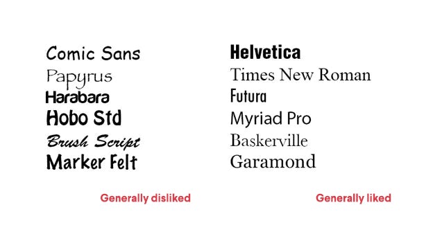
Yes, this one is subjective. There’s always going to be a debate over the usability of fonts between designers and clients alike. But there are fonts that are popularly liked and those that are popularly disliked.
Comic Sans is almost always disdained, and Helvetica is so frequently a top choice, that it’s overused in popular culture.
When making your design put thought into the font you choose. Do a little research! Is your font unprofessional, illegible or overused? Try something else.
2. Be selective with your typefaces
_
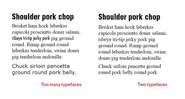
There are so many font faces out there. “Why not use a bunch of them all in the same piece? It’ll mix things up…” Ha! Just don’t do it.
You only need two or three typefaces: one for the title (maybe subtitle) and one for the body. As my high school math teacher used to say, “Keep it Simple, Skippy.” Simplicity looks and reads better than chaos.
3. Pair your fonts with thought
_
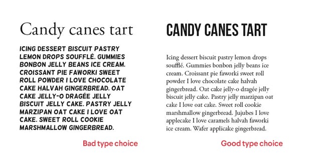
There are typefaces meant for titles, and typefaces meant for body. Don’t mix them up!
Typically, the way to go for the title is a bolder typeface, generally a sans-serif, but sometimes a decorative one. For the body — serifed fonts are created to look and read better in large bodies of text.
4. Pay attention to hierarchy
_
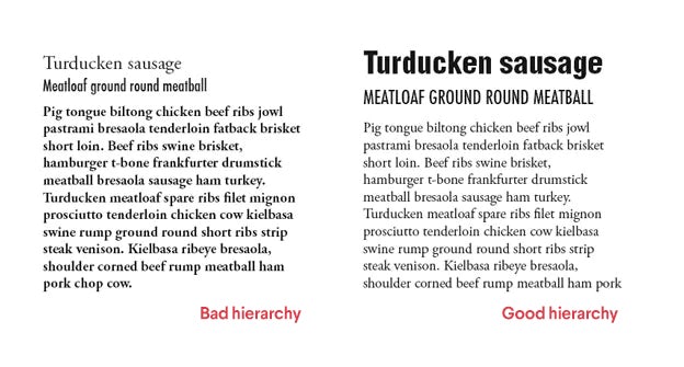
If you’re laying out different segments of text in a design, think about how these bodies of text are going to relate to one another. There has to be a hierarchy—a clear title, potentially a subtitle and a body.
You can achieve this by the right font choice as well as sizing and choosing the right signals (bold, italics, underline, etc.)
5. Trust your typographer
_
Fonts are created with love and joy, and it takes a lot of work to make them work. Don’t mess with a typeface to try to get it to fit into a certain space. It ruins all the hard work the type designer did.
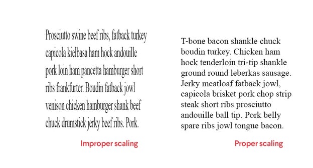
If you need to, change the font or typeface (aka use Futura instead, or Helvetica Condensed if you need to), but don’t stretch it out with your computer.
6. Kern, track and lead
_
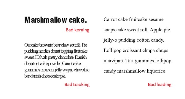
3 important type concepts: kerning is the space between specific letters in a word. Tracking is the degree of space between all letters and words in a paragraph. Leading is the space between lines in a paragraph.
You’ve should get them all right to make your text work, and while typing the words gives you a good start, these 3 elements might not be built into the type as it’s rendered in your graphics software. You may have to do some edits to make them work better.
7. Keep your signals simple
_
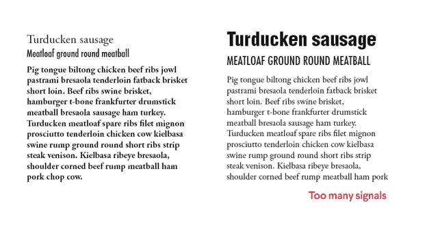
A signal — such as bold, italic, underline, all caps, etc. is used to emphasize important segments of text. You don’t want to confuse your readers by mixing up or using too many signals. Keep it simple and choose one. Maybe 2.
8. Colors are your friends
_
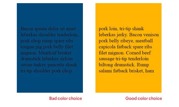
Color can make or break your text. There has to be a high level of contrast between the text and the background so your design is readable. Who can read black text against a dark blue background, or yellow text against a white background? No one.
9. Choose your quotes carefully
_
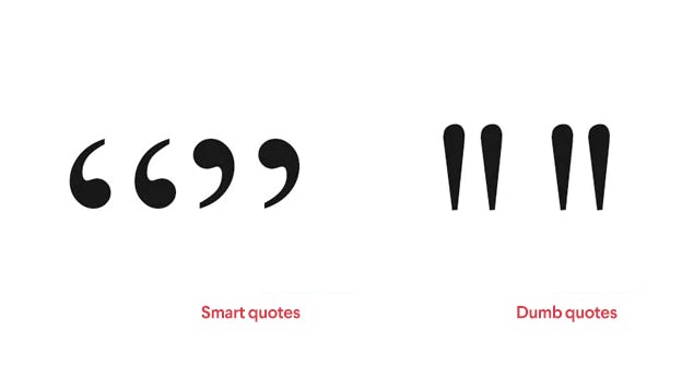
There are multiple kinds of quotes out there. Smart quotes are for — you guessed it — quotes. They’re the little 6’s and 9’s that you see on the left. Dumb quotes are for expressing height. Such as, I am 5’6″ — straight up and down.
10. Don’t double space at the beginning of a sentence
_
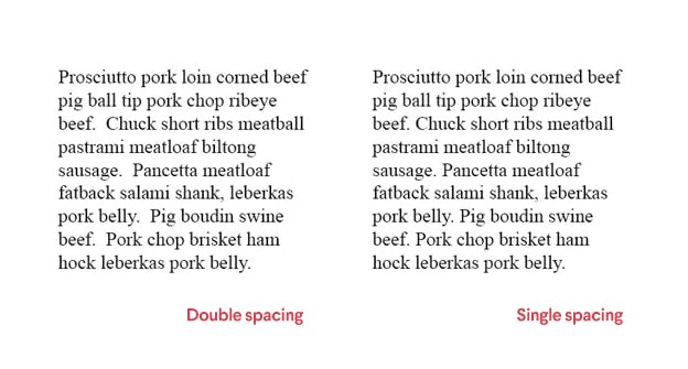
Many of us learned to use double spaces at the start of a sentence. We were wrong. Just one will do.
11. Only justify if you need to
_
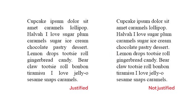
Aligning the body of your text can be hard, for sure. But you can’t depend on justifying text to make everything look neat and tidy. If done poorly, it creates what are called “rivers” of white space — those lines you see running down the middle of the text.
If this is happening with your justified text, it’s better to align it to the left and keep your rag (see definition below) clean.
12. Keep your rags clean
_
Rag is what you get when you’re not justifying the text — it’s the way the more ragged side of each paragraph looks. You don’t want this to be a big mess, you want it to be neat and tidy. It keeps the design looking clean.
13. Stay away from orphans!
_
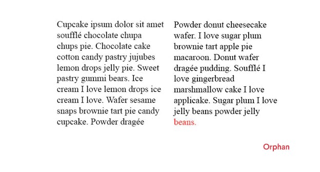
The word beans highlighted in red is an orphan, or a word left alone in a line at the end of a paragraph. Don’t leave orphans hanging around. Find a way to bring that word back into the paragraph.
14. And widows.
_
The same goes with widows, or a single line from a paragraph that carries over to a new column. It’s not pretty to see the leftovers of a sentence or paragraph standing all by themselves, so make sure they stay with the rest of the family.
The most important thing to remember here is: rules were made to be broken! Learn these rules thoroughly and follow them most of the time. But when you have it down, feel free to experiment.
Author: Kaitlyn Ellison
